2016 Election
Margin of Victory
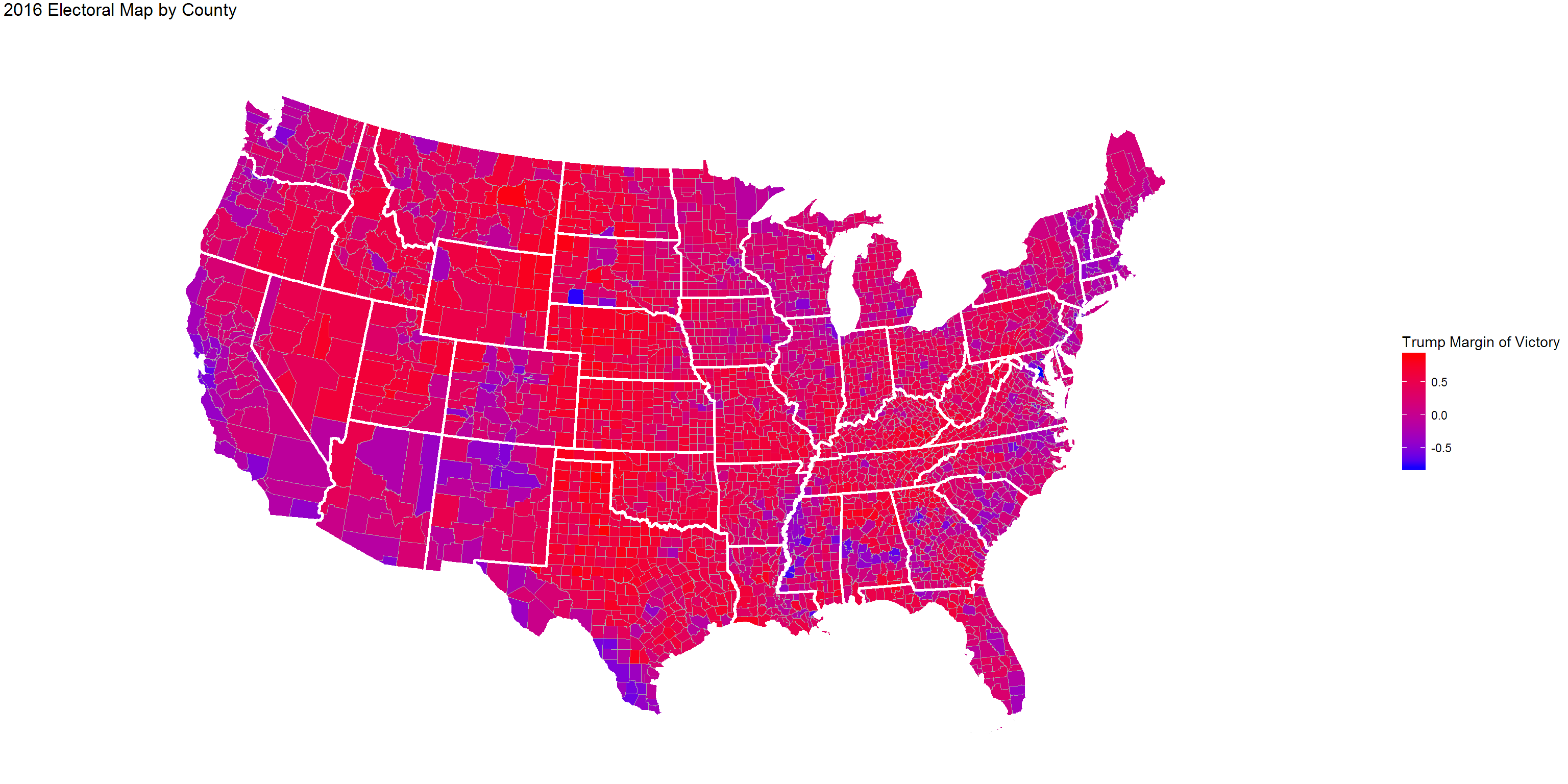
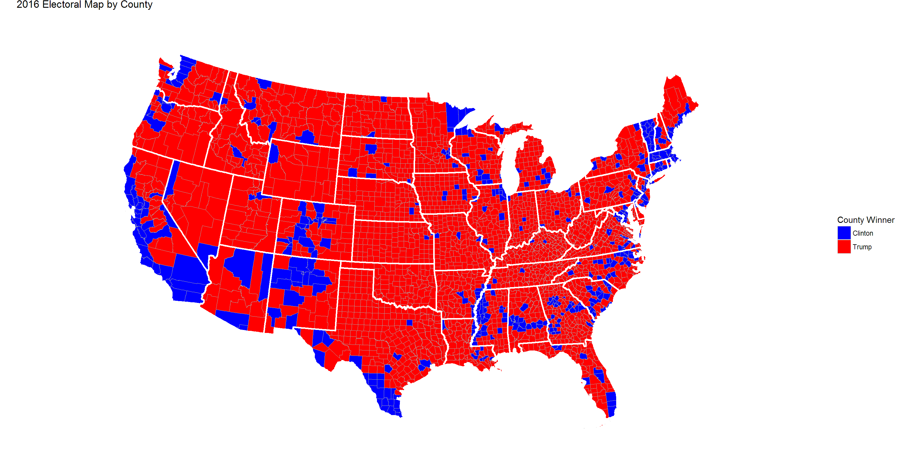
Let’s take a look at the 2016 electoral map, divided by county.
Gradient Map

The gradient within the map represents the margin of victory, from 60% or greater margin of victory for Trump in red to 60% or more margin of victory for Clinton in blue.
Naturally, Clinton has a visible edge in more urban, coastal areas while Trump has an advantage in more rural areas.
Pure Win-Loss
We can clarify the win by county by removing the gradient.

Interactive
Let’s check out a few interactive maps created with leaflet. Clinton narrowly won Virginia while Trump narrowly won Pennsylvania. Clicking on the county will give you its name, Trump’s margin of victory, as well as each candidate’s respective number of votes (and share of the vote).